

A relationship between light and space. And that’s it.
Via cope1


all the office stationery can be printed on a piece of paper without wasting paper.
And probably this is a white space that we should reduce instead of increasing.
maybe this is the positivity in reducing white space.
Via Behance
via http://grammar.about.com/od/rs/g/Spacing.htm
“There’s an old saying: ‘White space is nice.’ Amateurs tends to pack every nook and cranny of space with visuals and type. Don’t. White space is not your enemy.”
(Kim Golombisky and Rebecca Hagen, White Space Is Not Your Enemy: A Beginner’s Guide to Communicating Visually Through Graphic, Web and Multimedia Design. Focal Press, 2010)
The Rhetoric of Spacing
“White space includes the spacing of symbols, words, sentences, even letters at times; the spacing (or ‘leading’) of lines; paragraph and other indentions, space left at paragraph ends, and extra space sometimes left between paragraphs; space to the right and left of centered lines; and blank or partly blank pages. The rhetorical value of white space–a matter clearer to printers than to most teachers and writers–appears by absence when words are unspaced, when the page is crowded to the edges, or when matter which ought to be in half a dozen paragraphs is set as an unbroken phalanx paragraph. White space judiciously employed makes communication easier and more pleasurable. It is for this reason that publishers use so much paper for well-proportioned margins, and that advertisers pay heavily for space which they do not fill with words. White space may be considered in three aspects: as a removal of obstructions, so that the reader may read; as a means of indicating transitions, e.g. from paragraph to paragraph; and as an important element in typographical design.”
(George Summey, Modern Punctuation: Its Utilities and Conventions. Oxford Univ. Press, 1919)
Poets have written of cloth “white as the driven snow” (Shakespeare), “Dusk faces with white silken turbans wreath’d” (Milton), sea spray like “wild white horses” (Arnold), the moon as an “orbed maiden, with white fire laden” (Shelley). Tennyson’s Arthurian heroes rejoice that “the world is white with May.” As a colour, white is a metaphor for many emotions and for concepts ranging from purity to death…providing cool white space, making an emphatic statement.
“… in graphic design, white is too often thought of as something to cover up or get rid of, not something to explore and celebrate.”
Gail Deibler Finke
Cincinnati,
April 2000White “space”
What is not,
helps us define what is.What is not,
soon becomes what is.The what is,
is what was note.What was left out,
is just as important
as what is put in.White space
is as real as what fills it.All acts of creation start with a blank canvas (whitespace)…
use it wisely.
From book: White Graphics: The Power of White in Graphic Design by Gail Deibler Finke
Book on amazon
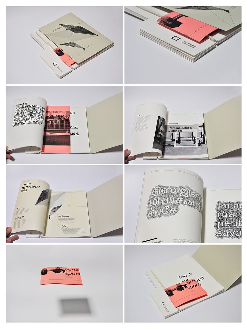
Why is it so uncomfortable to stand really close to a stranger? Sure, there are the potentially icky things. Sometimes an elevator car is so crowded that you can smell a fellow rider’s shampoo or chewing gum (or worse). But even when a stranger is perfectly groomed, it’s usually a bit revolting to be pressed against him in public. Why?
Evolution seems to have programmed this discomfort via a brain structure called the amygdalae, a pair of almond-shaped brain regions deep within each temporal lobe that control fear and the processing of emotion. It’s your amygdalae that keep you from getting so close to another person that he could easily reach out, gouge an eye, and then drag your woman off by her hair.
Read more at Times health

2011
An installation at St Philips Building, Sheffield st, London, WC2A 2EX
An exhibition to mark the life of the St Philips Building was quickly organised before its imminent demolition. Dominic Wilcox was one of those asked to create something in the buliding that would reference the buildings history in some way. The St Philips building started in 1903 as a workhouse Infirmary for the poor before going on to be a hospital for women and then bought by the London School of Economics.On visiting St Philips Dominic found the last remaining office, left abandonded and intact.
“I thought that it was as if the room was waiting to die and I wanted to ease its transition from this world. My thought for the office was to leave it intact but to remove the colour from every aspect in the room (via white paint) thereby taking away a layer of reality and connection to our world as it moves closer to its imminent death.” Dominic Wilcox
via Dominic Wilcox
Waiting Room from Dominic Wilcox on Vimeo.
—————————————–
I thought the use of white to signify impending doom leaves a very deep impression in people’s mind.
This treatment of physical, visually seen (directly) “whitespace”, I perceive as something portraying reality instead
It is that kind of uncertainty, recalling what exactly the colour of the object is..as if recalling someone close to you leaving, having flashbacks memories on the interaction between you and the person that passed away. almost colourless, fading away. It is the non-existence of the person in future that makes one person ache.
It is the memories and connections we have with the person/object that make us ache.
Everyone is talking about time management these days and warnings about balancing between research vs execution and also making things work.
Learning to enjoy our own project process is important too. But the word “FYP” will just put all enjoyment aside. no. it wont be a fyp project but more of finding out something I want to know, and sharing it with people through visual communications.
Someone discussed about how projects should first catch people’s attention with something awesome first so that people will move to look further into the process journal, methodology, research…and finding out what it really is. It just don’t only work in the arts and design industry, but also in business, science… all fields.
In the mist of all the mugging and researching, I kind of forgotten that common people don’t look at how much work you have done to determine how good the project is. They look for something that interest them and relate to them. Then they grasp the general concept of the project, influence how they think and remember them when they leave.
ooohhh.. too much to handle.
without a physical sketch. Its all mind to hand.
impressive skills
Mikito Ozeki / Cut Out from mikitoozeki on Vimeo.
via Mikito
Other than lots of practice, he is one that can see negative space very well to sketch out the positive image.


still on the way to get all the information in.
I don’t know if it will still look like this in the end or I should spread my focus on exams and other modules..
Anyway, one thing learnt through random quick photographing of work vs executing the work: complexity don’t go through people’s mind. Simplicity does.
